The Dashboard is the first screen you see when you log into ClickFlare. It gives you an at-a-glance view of how all your campaigns are performing across the selected time period: total visits, revenue, cost, profit, and ROI in one place, without having to open individual campaigns.

The Metric Tiles
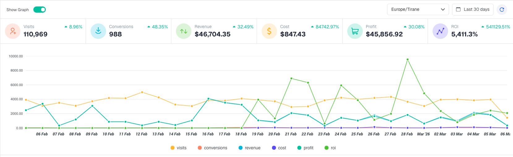
Across the top of the dashboard, six metric tiles show your totals for the selected time period. Each tile shows the raw number plus a percentage change compared to the same period immediately before it. A green arrow means the metric went up; a red arrow means it went down. Whether up or down is good depends on the metric.
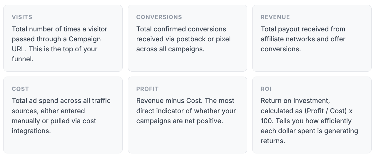
The percentage next to each metric compares your current period to the same-length period immediately before it. If you are viewing the last 30 days, the comparison is against the 30 days before that. A large cost increase paired with a revenue increase is normal when scaling. The number to watch is whether Profit and ROI are moving in the right direction.
The Performance Graph
Below the metric tiles, the graph plots all six metrics over time as individual color-coded lines. By default it shows the last 30 days, with each day as a data point.
Changing the time period
Use the date selector in the top-right corner of the dashboard to change the reporting window. Preset options range from 1 day to 6 months, or you can pick a custom date range using the calendar. Click Apply after selecting your dates and the graph and all metric tiles update together.
Showing and hiding metrics on the graph
Below the graph you will find the legend with the six metric labels. Clicking any label toggles that line on or off. This is useful when you want to isolate a specific metric. For example, hiding everything except Revenue and Cost to see their relationship clearly over time.
Toggling the graph off
If you prefer a cleaner view focused on the tables below, use the Show Graph toggle in the top-left of the dashboard to hide the graph entirely. The metric tiles stay visible.
All dashboard data is displayed in the timezone you set in General Settings. The current timezone is shown next to the date selector. If your data looks shifted compared to your traffic source, check that both are set to the same timezone.
The Performance Tables
Below the graph, four tables show your top performers broken down by Campaigns, Traffic Sources, Offers, and Landers. Each table shows the same core columns: Visits, Conversions, Cost, Revenue, Profit, and ROI.
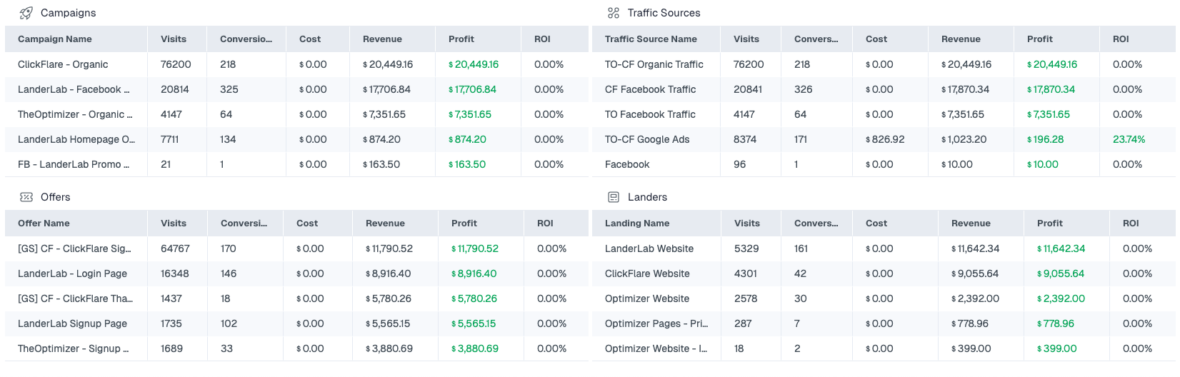
These tables are sorted by Visits by default and show your top five entries per category. They give you a fast read on which campaigns and assets are driving the most volume and which are actually profitable. Profit figures shown in green are positive; those in red are negative.
Clicking any row name takes you directly to that campaign, offer, lander, or traffic source for a full detailed report.
If your cost column shows zero across all campaigns, you have not yet connected a cost integration or entered manual cost values. Your Profit and ROI figures will be overstated until cost data is in. Set up cost tracking underIntegrationsor enter costs manually in each campaign.
The Left Sidebar
The sidebar on the left is your main navigation. It stays visible on every screen in ClickFlare. You can collapse it to icon-only mode using the arrow at the top to give yourself more working space.
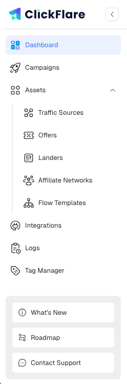
| Dashboard | The screen covered in this article. Your account-wide performance overview for the selected time period. |
| Campaigns | Where all your tracked campaigns live. Create new campaigns, view per-campaign stats, and access tracking URLs from here. |
| Assets | A collapsible section containing the building blocks used inside campaigns.Traffic Sources / Offers / Landers / Affiliate Networks / Flow Templates |
| Integrations | Connect external platforms to ClickFlare. Includes Conversion API integrations (Meta, TikTok, Google Ads), Cost Tracking integrations, Affiliate Network integrations, and Revenue Stream integrations. |
| Logs | A full audit trail of all events. Use Postback Status to verify conversion postbacks are being received, and Event Log to debug unexpected behavior. |
| Tag Manager | Deploy tracking scripts and third-party pixels across your landing pages without touching code. Organizes tags into containers. |
At the bottom of the sidebar you will also find What's New (release notes and new features), Roadmap (upcoming features), and Contact Support.
The Top Bar
The top bar contains three controls worth knowing about:
- Organization switcher: the dropdown in the top-left showing your account name (e.g. "TopAds"). If you work across multiple ClickFlare organizations or accounts, you can switch between them here without logging out. Each organization has its own campaigns, assets, and data.
- Search: the search bar in the center lets you find any campaign, offer, lander, or traffic source by name without navigating through the sidebar.
- Select Workspaces: if your account has multiple workspaces, use this dropdown to filter the entire dashboard view to a specific workspace. All metric tiles, the graph, and the tables update to show only data from the selected workspace.
- AI: the AI button (marked NEW) opens ClickFlare's AI Copilot, which connects via MCP and lets you query your data, get optimization suggestions, and automate reporting tasks conversationally.
FREQUENTLY ASKED QUESTIONS
Got questions? Find the answers below:
Q1: Why does the dashboard show different numbers than my traffic source?
A1: The most common cause is a timezone mismatch. Check that ClickFlare's timezone (visible next to the date selector) matches your traffic source's reporting timezone. A second common cause is that ClickFlare counts visits from the moment the Campaign URL is hit, while traffic sources count clicks from when the ad is clicked. There is typically a small difference due to network latency and bot filtering.
Q2: Why is my cost showing as $0.00?
A2: Cost data is not automatic unless you have a Cost Tracking integration set up. Without one, you need to enter cost values manually in each campaign's settings, or upload them via the Cost Upload feature under Settings. Until cost data is present, Profit and ROI calculations are not accurate.
Q3: The dashboard shows fewer conversions than my affiliate network. Why?
A3: ClickFlare only records conversions when a postback or pixel fires back to it with a valid Click ID. If the Click ID is not being passed correctly through your offer URL, or if the network is not sending postbacks for all conversions, the counts will differ. Check Logs → Postback Status to see which postbacks are arriving and whether any are being rejected.
Q4: Can I see data for just one campaign on the dashboard?
A4: The dashboard always shows account-wide totals. To see data for a specific campaign, click the campaign name in the Campaigns table or go to Campaigns in the sidebar and open the campaign directly. For cross-campaign reporting with custom filters,